
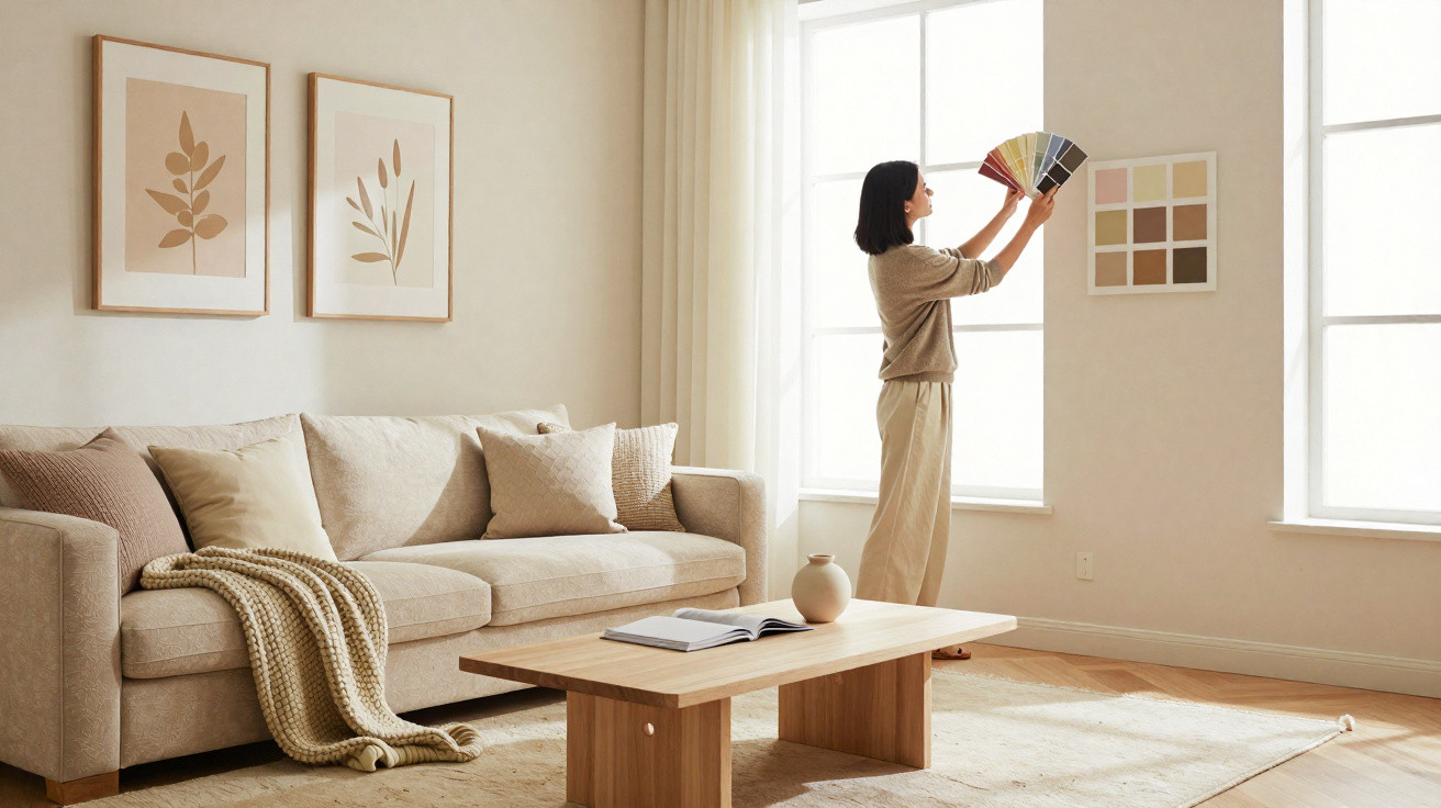
Monochromatic décor is often linked with predictable interiors that lack character. In reality, however, this approach opens up countless possibilities, ranging from understated schemes to bold, striking compositions.
According to architect Bruno Moraes, who leads BMA Studio, it all comes down to intention, with the key lying in how tonal nuances are used. “Monochrome need not be seen as a limitation, but as an opportunity. It encourages the eye to look more closely at subtle variations and details that might go unnoticed in a multicoloured project,” he says.
Making the right choices
The first step, naturally, is to decide which colour will form the room’s foundation, then build a spectrum of variations ranging from the palest to the deepest shades. This graduation prevents the scheme from feeling flat, introduces layers of interest and balances the colour’s intensity. “Those who choose green can combine softer shades on the walls with more intense versions in the furniture,” Bruno Moraes illustrates.
It is equally important to select the materials that will carry the chosen palette. Monochrome only acquires depth when it is applied across a range of surfaces, including fabrics, flooring, wall finishes and decorative accessories. “Monochrome is much more about harmony than repetition. Playing with finishes, sheen and mattness is therefore a way to enrich the room without disrupting its unity. A wall in matt paint can sit alongside a lacquered piece of furniture in the same colour, yet the results will be completely different,” the professional explains.
Paint and joinery
For Bruno Moraes, paint is undoubtedly the most accessible starting point for a monochromatic scheme. A wall finished in a deeper shade can act as the palette’s anchor, while the other walls take on lighter variations. This is particularly effective in shared spaces, such as living rooms and television rooms, as it creates contrast without bringing in additional colours. Bespoke joinery also deserves attention: sofas, shelving, cupboards and panels can all be finished in the selected palette, strengthening the feeling of continuity.
In kitchens, for instance, grey cabinetry paired with appliances on the same chromatic scale creates a sophisticated, cohesive setting. In bedrooms, a headboard and fitted wardrobe in coordinated shades provide consistency while retaining comfort. “Bespoke joinery is an ally because it allows colour to be explored in a controlled and functional way,” the architect adds.
Textures in the composition
Beyond surface finishes, fabrics such as velvet, linen and cotton can create tactile and visual contrasts even when they remain within one palette, elevating the interior. “Even when we use a neutral palette, such as off-white or grey, textures can bring complexity to the space. What makes the difference is not the colour itself, but how much we can explore its variation through different materials, fabrics and finishes,” he says.
Monochrome at different scales
One of this style’s greatest strengths is its ability to adapt to both small and large properties. In compact flats, the visual continuity created by a single colour helps to expand the perceived sense of space. With no strong contrasts to interrupt the view, the eye moves through the room freely, making it appear larger than it truly is.
In projects with more generous proportions, monochrome becomes a tool for enhancing grandeur. A double-height living room benefits from a single palette that unifies the large area and lends the setting greater sophistication. The choice should, however, reflect the intended impact: neutral tones convey serenity, while bolder shades emphasise the space’s scale.
“Monochrome adapts to the size of the property. In smaller homes, it is a solution for integration and visual expansion; in larger ones, it is a strategy for creating coherence and elegance. That is why this approach is never limited to one particular project profile,” the professional explains.
Overcoming the fear
Many homeowners are hesitant to choose monochromatic décor because they believe they may tire of it quickly. A practical alternative is to begin in rooms that are used less often. These spaces make it possible to test the aesthetic on a smaller scale and understand how monochrome affects the atmosphere. Another way to ease uncertainty is to introduce the palette through neutral foundations, varying the intensity in accessories. For example, use grey on walls and furniture, then add cushions, rugs or artwork in the same colour.
By Emilie Guimarães




Comments
No comments yet. Be the first to comment!
Leave a Comment