
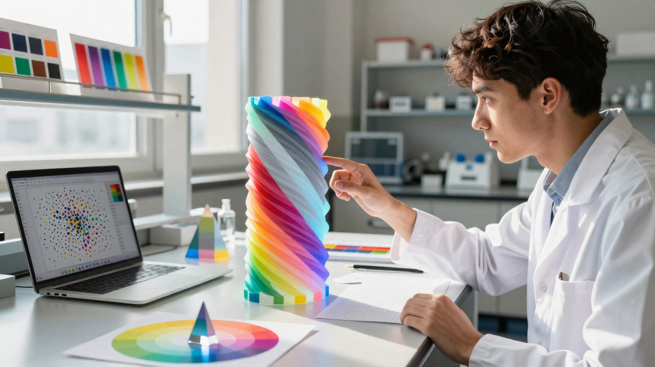
Phone photo-editing apps tend to rely on the same three controls: one changes brightness, another intensifies or softens colour, and the third alters hue.
They can seem like neat, human-made tools, designed specifically for adjusting our photographs.
But a group of scientists argues that these three properties were not invented by people at all. Instead, they are embedded in the mathematics of colour, and uncovering them required completing work a celebrated 20th-century physicist had left unfinished.
An unfinished model
The human eye contains three types of colour-sensitive cells, responsive to red, green and blue light. Together, their signals combine to create every colour a person can perceive.
This gives colour space three dimensions: a map used by scientists to compare colours.
During the 19th century, mathematician Bernhard Riemann proposed that this map was curved rather than flat.
About a century ago, physicist Erwin Schrödinger – known for Schrödinger’s cat – used this curved map to define hue, saturation and lightness.
For around 100 years, those definitions shaped colour science. Then researchers at Los Alamos National Laboratory (LANL) encountered a problem.
Computational scientist Roxana Bujack was developing colour tools for scientific imagery when the established mathematics began to show weaknesses.
The missing line
Schrödinger’s entire framework depended on a reference line: the sequence of pure greys, running from black at one end to white at the other. He defined hue, saturation and lightness according to a colour’s position relative to that line.
Yet the framework contained a gap. Schrödinger never mathematically defined the grey line itself. Although he relied on it throughout, it remained an assumption unconnected to the geometry.
The omission mattered more than it might initially appear. If greys have no fixed position, every definition based upon them becomes unstable.
Without a mathematically specified neutral axis, the older model was incomplete.
Defining the greys in colour space
Bujack’s team aimed to establish that line using colour geometry alone, without introducing external assumptions.
Researchers had extended Schrödinger’s definitions for generations, but none had formally identified the line on which all of them depended.
Their solution placed the greys at the greyest colour for every brightness level: the shade closest to black when the amount of light is kept constant.
To achieve this, the team moved beyond Riemann’s curved model into what they describe as a non-Riemannian space.
For the first time, the line emerged directly from the geometry. A previous paper by the group had demonstrated that this shift was necessary.
When small changes in colour are added together, their combined amount appears greater than the single colour jump people actually perceive.
Colours that drift
A further issue also required attention. As a light is brightened or dimmed, some colours appear to shift towards another hue. Yellow, for example, may seem more greenish as the light fades, even though the colour itself has not changed.
Schrödinger’s mathematics addressed this by drawing a straight line from a colour to black. Bujack’s team abandoned that approach.
Instead, they used the genuinely shortest path through colour space – a route that curves in the same way that perception does.
On a curved surface, the shortest route must bend, and colour space has precisely this sort of curvature. These curved paths captured the drifting hues that the earlier straight lines overlooked.
Testing colour with human eyes
Incorporating the greys into this new type of space solved the diminishing-returns issue, but it created another concern. The greyest colour might not be located where the shortest path towards the greys ended.
The team examined this using real observers. Participants viewed rows of coloured squares and selected the greys that appeared closest to a particular colour.
This allowed the researchers to determine whether the greyest patch appeared where their mathematics predicted it would.
In the initial test, the two agreed. The greys selected by participants occurred where the model forecast, leaving the concern only theoretical.
A separate study had found that colour experiments conducted in this manner are reliable in laboratory conditions.
A complete colour model
Now that the greys have been defined, the model is complete. Hue, saturation and lightness all derive from one measure: the perceived distance between two colours.
The team’s broader argument concerns the origin of these qualities. Bujack’s group maintains that hue, saturation and lightness are not created by language or upbringing, as some explanations of colour perception suggest. They arise from the mathematics of colour.
“This metric geometrically encodes the perceived color distance,” Bujack said.
Their measure assigns a single geometry-based number to every pair of shades: the distance between them as they appear to the eye.
Properties that once appeared to rely on outside definitions now arise from colour itself.
Broader implications of the study
What has now been resolved rests on a single line. The row of greys at colour’s centre has a genuine mathematical definition, and the century-old model built around it finally works as a whole.
Its practical benefit is greater precision. Technologies that must match what people really see – including cameras, displays and scientific visualisations – rely on models of perceived colour differences.
A more precise map of colour could make such tools more faithful to human vision.
The scientific consequences extend further. Researchers who convert data into images – such as brain scans, climate maps and simulations – depend on colour to communicate meaning accurately.
A model founded on robust geometry moves their future work into areas that the field had previously avoided.





Comments
No comments yet. Be the first to comment!
Leave a Comment