
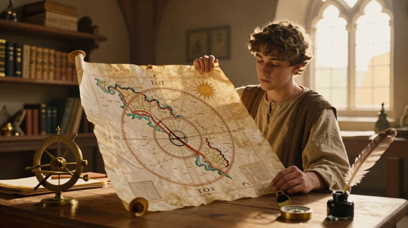
During the Middle Ages, numerous European maps placed east at the top, as their purpose extended beyond measuring distances. They also arranged the world around religious reference points, making sunrise a symbolic direction.
Why did east appear at the top of medieval maps?
For medieval Christian cartographers, east was linked with Eden, the arrival of light and biblical events. Positioning it at the top turned the map into a spiritual interpretation of the world rather than merely a geographical and symbolic instrument.
Jerusalem was often shown at the centre of these depictions, acting as the symbolic axis of Christian history. This placement did not reflect a modern measurement of distances; instead, it conveyed a theological vision in which sacred places structured the known world.
This arrangement brought together several meanings:
- East: identified the direction of the Sun’s daily rising.
- Paradise: Eden was often imagined at the far eastern edge.
- Jerusalem: held the symbolic centre in many Christian representations.
- Religion: biblical episodes helped to arrange the known world.
- Orientation: the top of the map expressed cultural values rather than a natural rule.
How did T-O maps work?
T-O maps condensed the inhabited world into a circle divided by a form resembling the letters T and O. Asia occupied the upper section, while Europe and Africa were placed below, separated by idealised seas and rivers.
Within this layout, the Mediterranean formed the vertical stem of the T, while the Don and Nile rivers made up its horizontal bar. The model was not intended to reproduce coastlines with precision, but to set out continents, peoples and historical events in an understandable order.
Where does the verb “to orient” come from?
The word “to orient” is connected to the Orient, a term associated with the side where the Sun rises. For centuries, turning a map towards the east could mean placing it in its proper reading position, reinforcing the connection between direction and reference.
The top of a map is not a rule of nature.
Any direction can be placed at the top.
The choice depends on the culture, purpose and conventions used by the cartographer.
Rotating a map does not change the continents’ actual positions on the planet.
This approach was not universal. Different societies arranged their maps according to their own traditions, aims and cultural centres. In several medieval Islamic works, south appears at the top, demonstrating that no direction has natural superiority or a cartographic obligation.
Before modern standardisation, a map might favour:
- east, for religious reasons or because of the position of sunrise;
- south, in line with conventions used by Islamic cartographers;
- north, as seen in ancient traditions and navigational charts;
- a sacred city or capital positioned at the centre of the representation;
- the direction most useful for the route or region being shown.
Why did some Islamic maps place south at the top?
The map created by al-Idrisi in 1154 is a celebrated example of this orientation, with south at the top. This choice corresponded with Islamic geographical conventions and shows that the top of a map is a decision, not a physical truth.
Chinese maps, Mediterranean portolan charts and local representations also used varied orientations. Some favoured north, while others favoured south, east or a direction suitable for the route depicted, because practical purpose could matter more than a single convention.
These differences demonstrate that:
- there is no absolute upper or lower part of space;
- maps are created according to cultural and practical needs;
- the selected centre can reveal political or religious priorities;
- orientation differs across periods, regions and cartographic traditions;
- north at the top is a dominant convention, not a geographical law.
How did north become the standard on modern maps?
Anyone familiar with a representation of Earth designed to reduce cartographic distortions can see that maps involve technical choices. The compass supported navigational charts, making north at the top increasingly convenient, although the shift was gradual.
The projection introduced by Gerardus Mercator in 1569 strengthened this convention by showing constant bearings as straight lines, a feature of great value to navigators. Its widespread adoption helped establish north at the top, yet maps remain constructions shaped by purpose and perspective.





Comments
No comments yet. Be the first to comment!
Leave a Comment